Origin of the Skunk & Logo from Evoker
something about skunks. the elusive and raunchy aroma of the best cannabis is often as foul as it is strong. there is such comfort and excitement that comes along with a bag of disgustingly foul cannabis. Funk, fuel, gas, halitosis, pine sol, menthol, oil leak, petrol, Burnt rubber, rot are some of the words that come to mind. where have some of the most elusive skunk terps gone? lost in f2 generations of existing skunk lines I would guess, waiting to be rediscovered. but that is a theory at best, and for another day.
in a world where branding has such a big influence on the consumer market. and my cannabis being something I feel so passionate about. I wanted a logo that could represent the brand. for me, cannabis is fun, playful, nostalgic. it brings out the creative juices, the inner child, the uninhibited.
growing up in new york city, delivery services were always a thing. car wash business cards, smoothie shops, the sock man and the highly notorious cartoon network. the branding was catchy fun and a sure fire mark of a high quality product.
so when it came time to put together a brand, what better than a cartoon character, a woodland critter, a skunk no less. having little desire to steal existing imagery I set out to get a logo from the talented artist and designer Ryan Robidoux aka Evoker One. I have known Ryan through the art community for a long time and was very excited to get his hand in on the project.
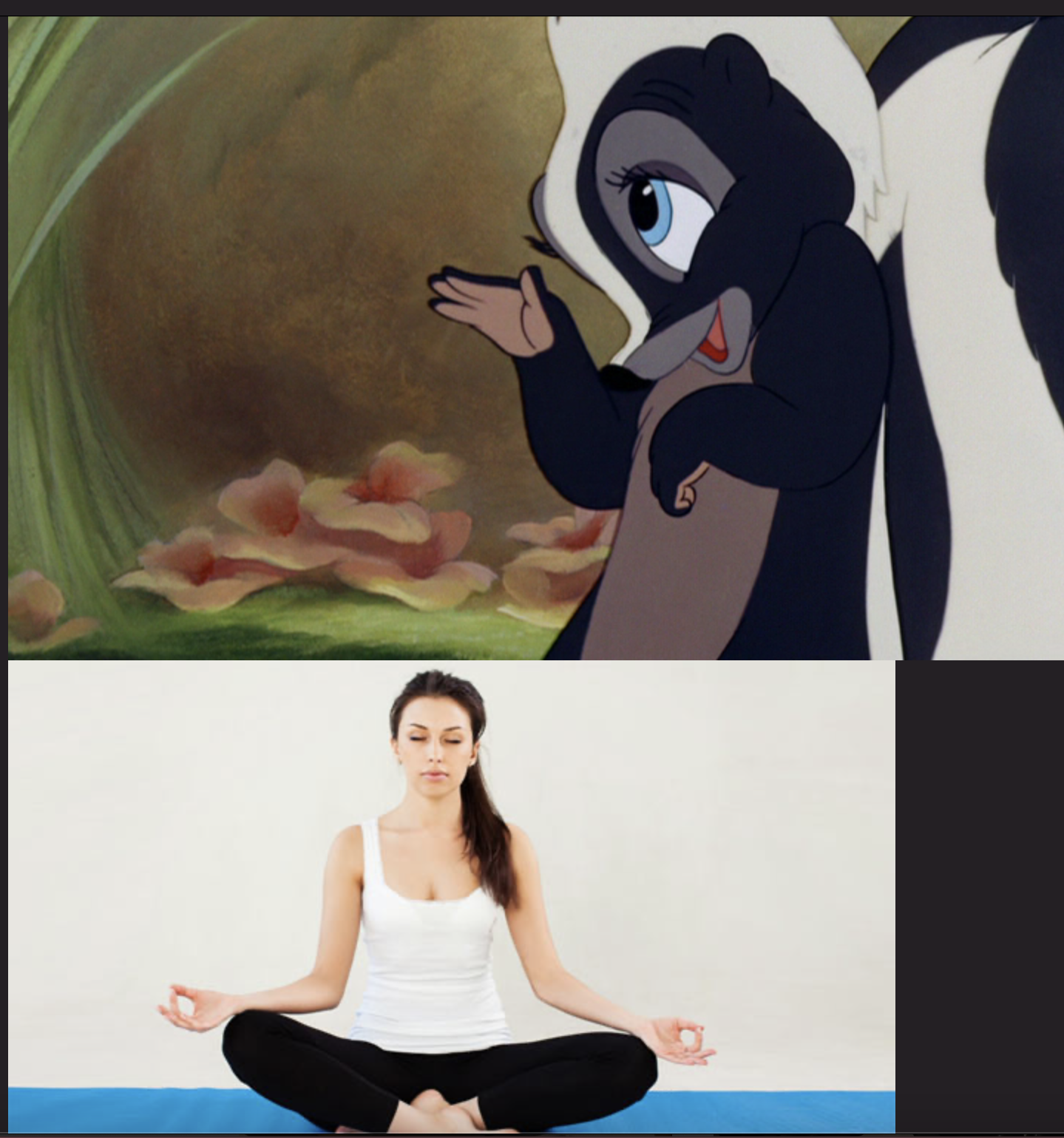
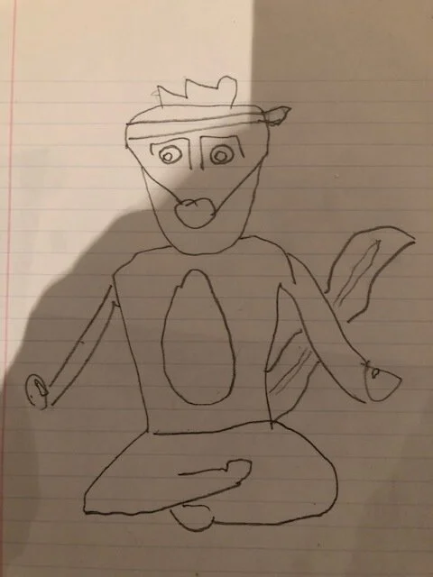
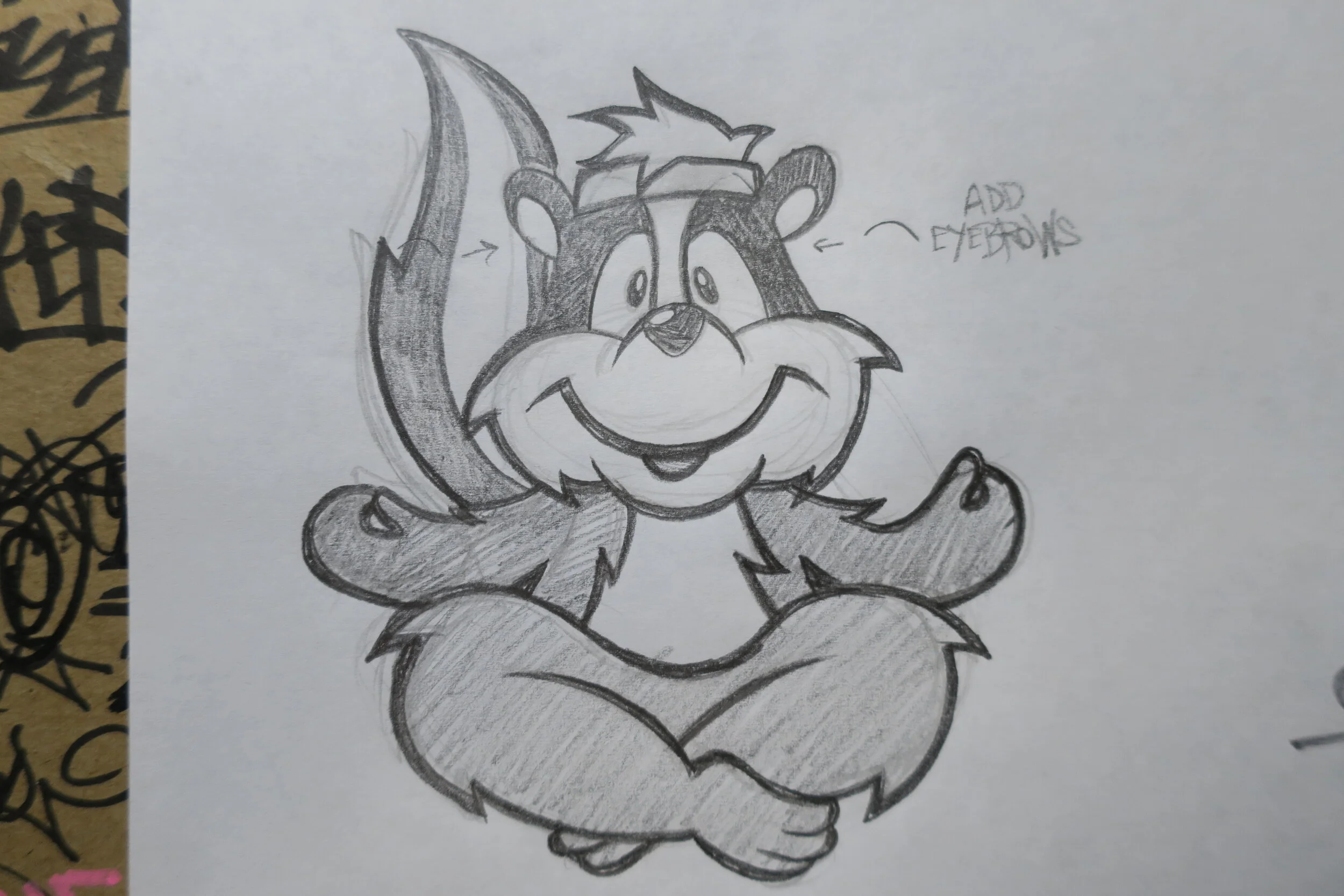
I hit up Ryan and explained what I was looking for and so on. I had been wearing a pink headband most all of the time and thought that would help tie it all together if the skunk had one as well. I wanted a skunk with a pink headband, sitting in sukhasana. Foul smelling weed, yoga and a pink flair. Felt like a pretty accurate representation. He told me he could help and that I should draw the skunk, in the position I wanted, so that he would know exactly what I wanted. I have the worst handwriting and my ability to draw is pretty pathetic. So I sent Ryan a series of images I took off the internet of skunks, and yoga poses in order to convey my message. Ryan responded insisting that I draw the skunk first, and that it was a necessary step in the process. I was not thrilled to make an embarrassing attempt at this and send to an artist whose work I know and respect, but I did what had to be done.
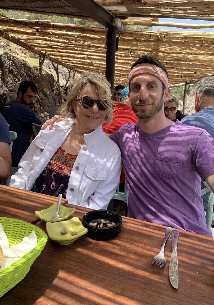
this is extremely embarrassing but I will include my terrible images and drawing below, Ryans sketch and the final logo. I’m also throwing in a shot of my mother and I, rocking the og headband that inspired it all. my mom did not appreciate my headband flex nor my sense of style in general. However if you check out the Eric Emanuel Adidas collab that this headband came from, you will notice that it is in fact, fire as fuck. anyways, that was the day teamingwithterps became a skunk.